Overview
Day Share is a social media app, which primarily focuses on parents who send their kids to daycare and teachers who teach at the same daycare. This helps in connecting parents with other parents and also getting a feed of what happened during the day. In addition, it helps teachers to send out updates on any upcoming events that would happen at the daycare center.
Objective: Media feed on what kids learned today and their activity at the daycare center.
Role: Lead Designer, Research, Information Architecture, Interaction, Visual design & testing
User Interviews
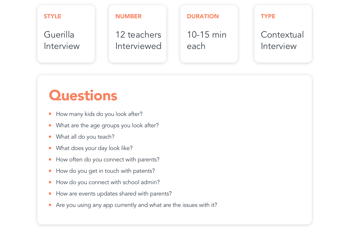
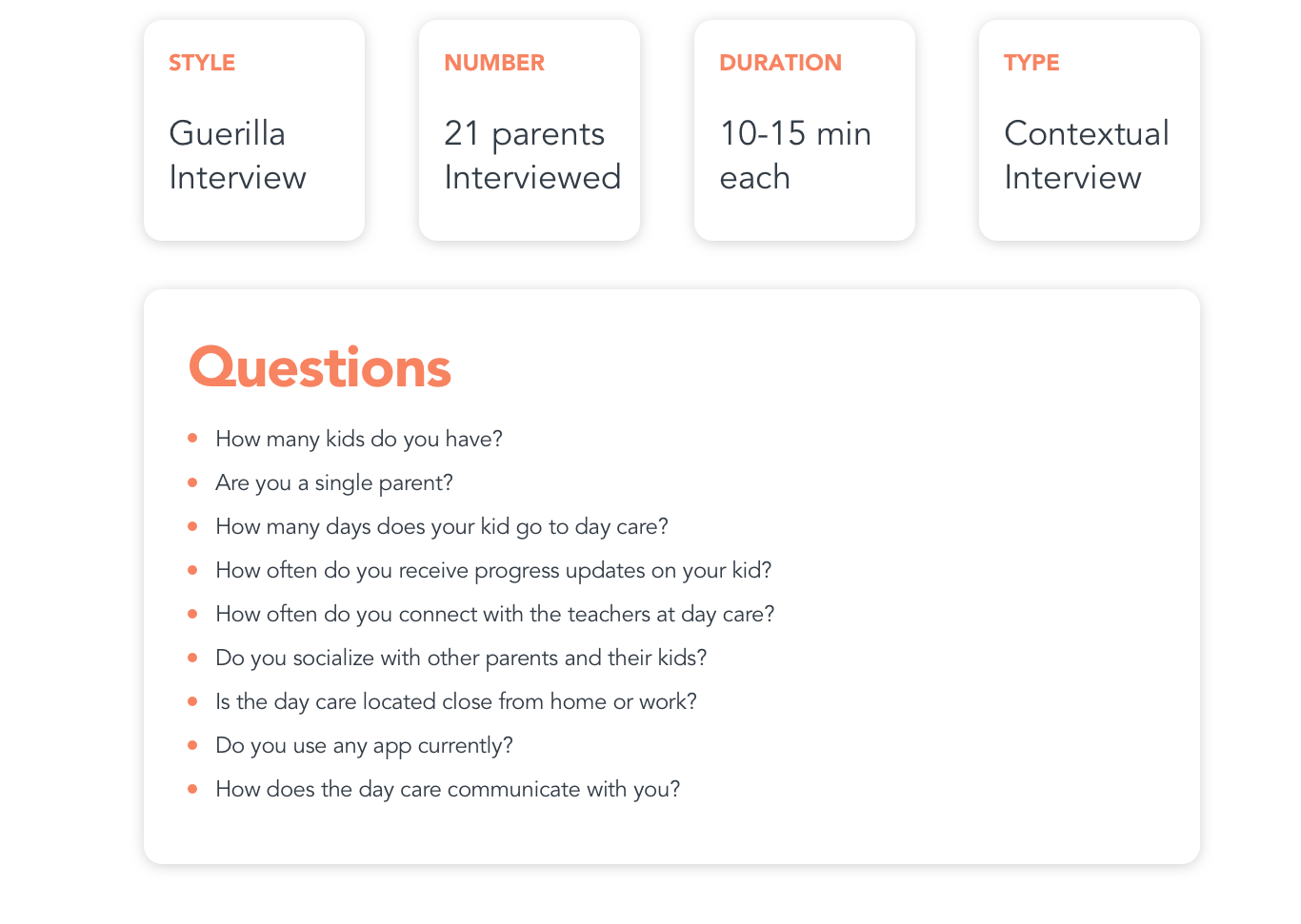
I conducted a series of casual guerilla-style interviews to get a general read of how parents connect with teachers and other parents.
Below are some of the questions that I asked during these interviews
Below are some of the questions that I asked during these interviews


Defining the Visuals
Thinking about the brand and the target audience, the visuals need to be playful, warm, and joyful. Even though the app will only be used by teachers and parent and it is meant for socializing, I wanted to make sure that the app is clean and simple.
Color Palette
The colors are picked carefully to give the app design a warm, friendly, and playful aesthetic
Typography
In order to make the app look trendy and professional Avenir was picked
as the typeface as it a modern and easy to read.
UX Flow
I started creating the information architecture and low-fi concepts for primary use cases. After having a go-ahead from the Product Manager, developers, and Stakeholders on the mockups, we began to conduct usability tests with the low-fidelity mockups. Once we had confidence in the design, we began digitalizing designs.
Wireframes
Before starting the design, its good to layout the flow of the screen in a low-fi template. I try to use a template where I can add basic notes regarding each screens.
Putting the Designs
Once documenting the different user flows, creating the brand, and laying out wireframes. The next step was to bring everything together and see if the design is looking the way it was envisioned originally.
Testing & Feedback
I tested the product at various stages of the project.
• Lo-fi prototypes were tested with the stakeholders weekly to get feedback on the functionality, content, and interactivity
of the product.
of the product.
• Unmoderated User testing - A few dummy groups were created to use the app. All participants were using the app to carry out hypothetical tasks.
• Beta Testing - Before releasing the app, we are testing it with a couple of day care centers. The app is currently being used by teachers and school directors to see how to add content and sharing updates on any upcoming events.
Web tool for Admins
Admins such as teachers and school directors have access to the web tool where they can create events or send
out bulk invites and notifications to parents.
out bulk invites and notifications to parents.