
Overview
As the Elementum team grew, it became increasingly important to maintain a consistent style and visual language across all areas of the product. With nearly over half a dozen products, it was clear that we needed more systematic ways to guide and leverage our collective efforts.
The initial outcome was to have a collection of reusable components, guided by clear standards, that can be assembled together to quickly build any number of consistent experiences.
Objective: To create a library of reusable components
Role: Visual Designer, Research, Information Architecture, Interaction, Visual design & testing
The Problem
After looking at JIRA and support tickets & one on one stakeholder interviews it was clear that Elementum needed a new design language
in order to make the platform consistent, intuitive and delightful.
in order to make the platform consistent, intuitive and delightful.

Challenges
1. Getting everyone onboard: A Design System is not a one-man project and if you want it to succeed you need everyone on board. The more integrated you want it the more disciplines you need at the table.
2. Planning & Priority: Failing to plan is planning to fail. We constantly toggle between working on our Design System and enhancing the application and planning and prioritizing our tasks is imperative.
3. Breaking this news to clients: Although, our clients wanted this change from a long long time. Yet, it was important to keep them involved and excited about the big changes we were planning.
Laying the foundations
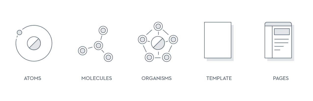
This system is based largely on the principles of atomic design. The key idea behind this methodology being small, independent - atomic - parts, can be combined into larger molecular structures.
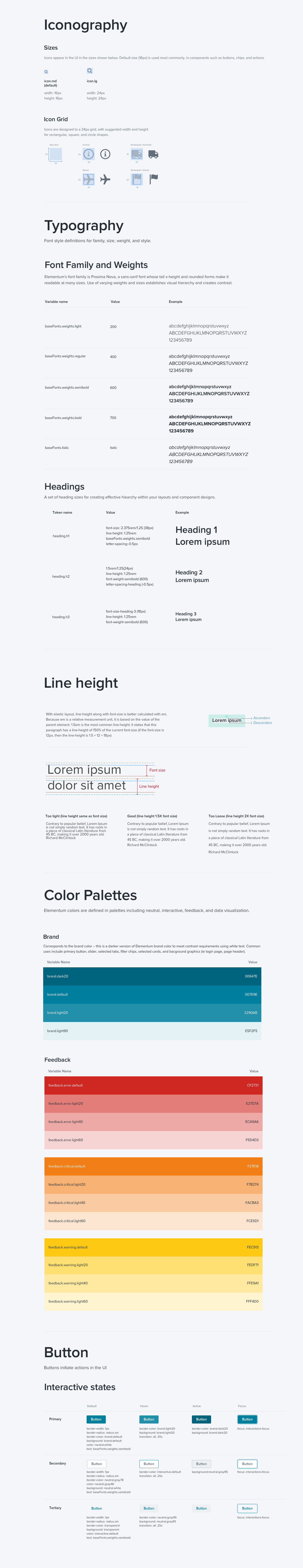
This foundation loosely defined our typography, colors, icons, spacing, navigation and information architecture. and proved essential for guiding our work in a unified direction. Reviewing our collective work at the end of each day, we began to see patterns emerge.
We course-corrected when necessary, and started defining our standardized components.
Bringing it all together
While creating these components, we collected them in a sketch master file, which we referred to throughout the design process. After a week or two, we began to see huge leaps in productivity by using the library when iterating on designs. One day, while putting together a last-minute prototype, our team was able to create nearly 50 screens within just a few hours by using the framework our library provided.
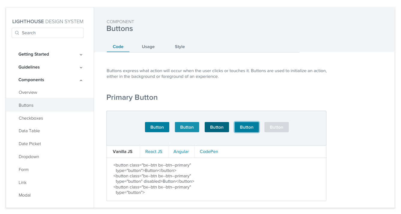
While the library was growing, we started organizing individual components into artboards containing similar items. These artboards were then organized into general categories. Later we planned on to create an internal website to document the system that can be used by both the devs and designers.
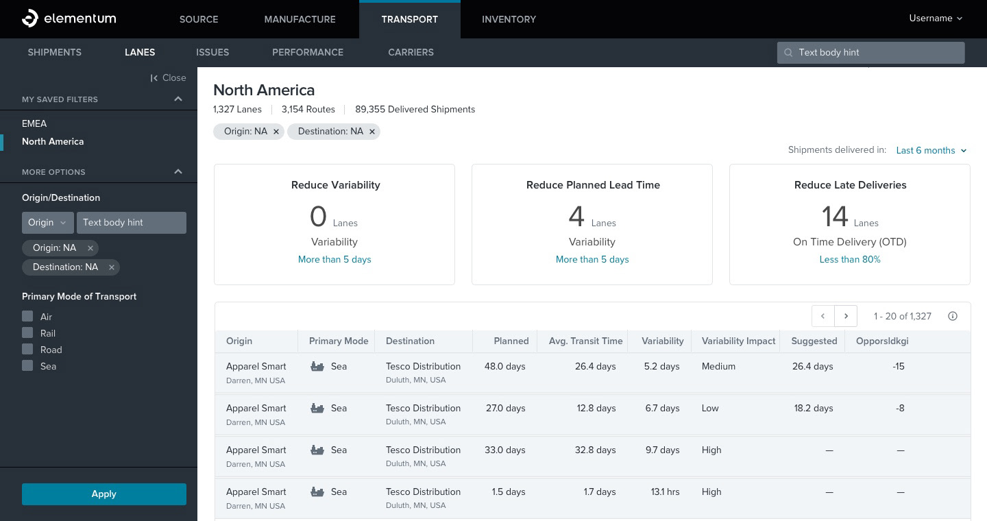
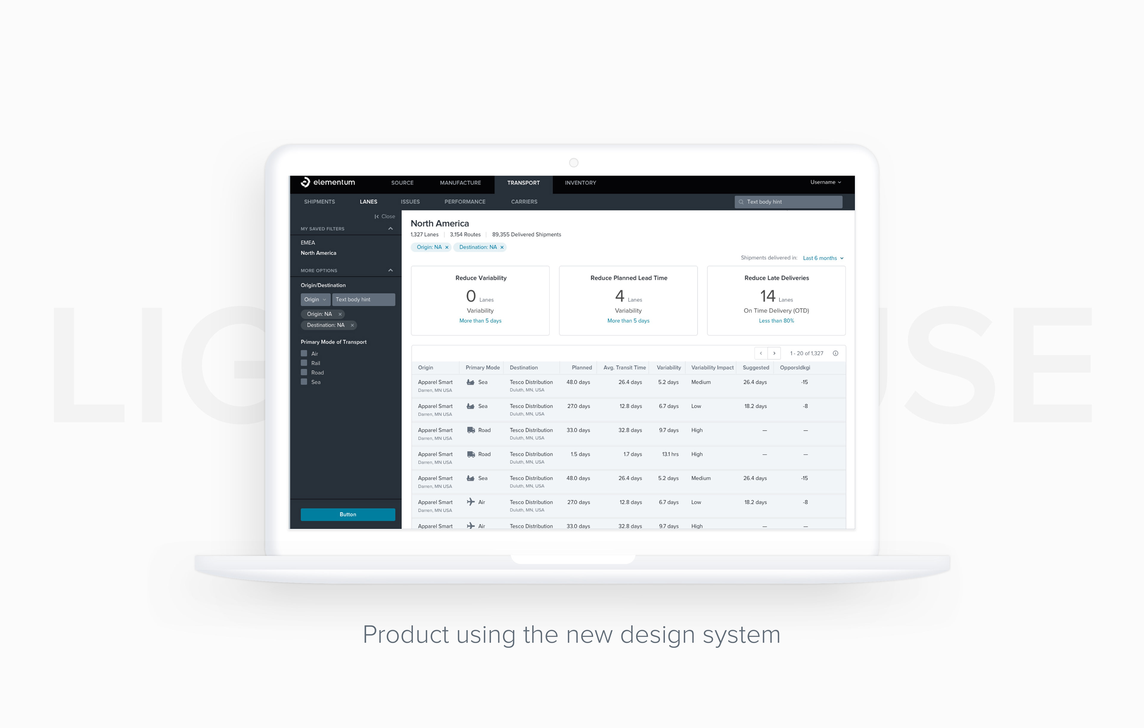
Listing Page
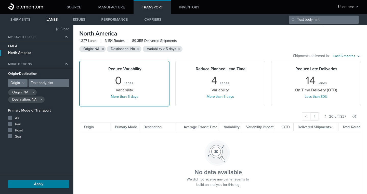
Listing with no filter result
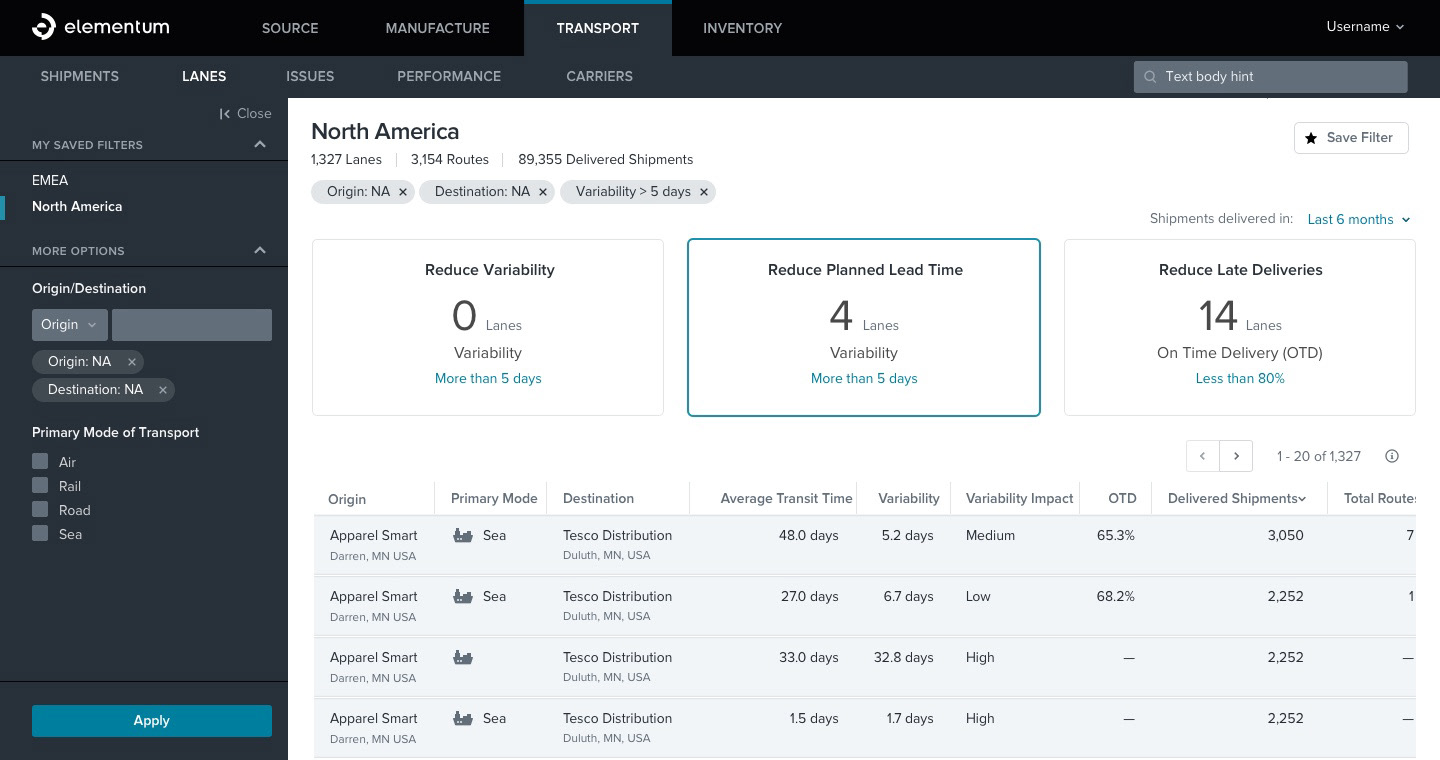
Listing withusing filters
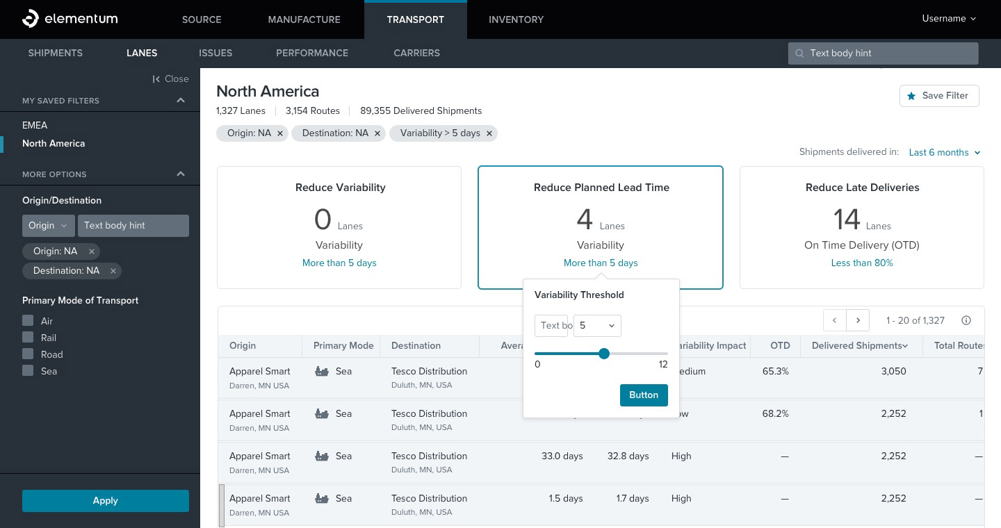
Threshold componet
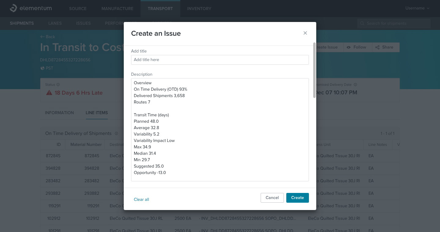
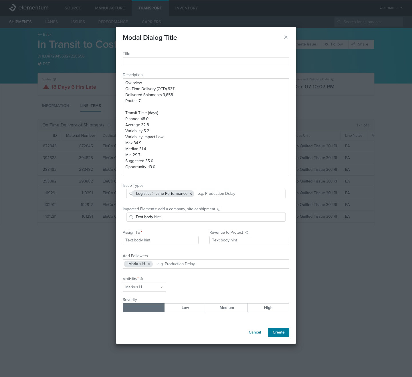
Create an issue modal for details page
Details page with modal
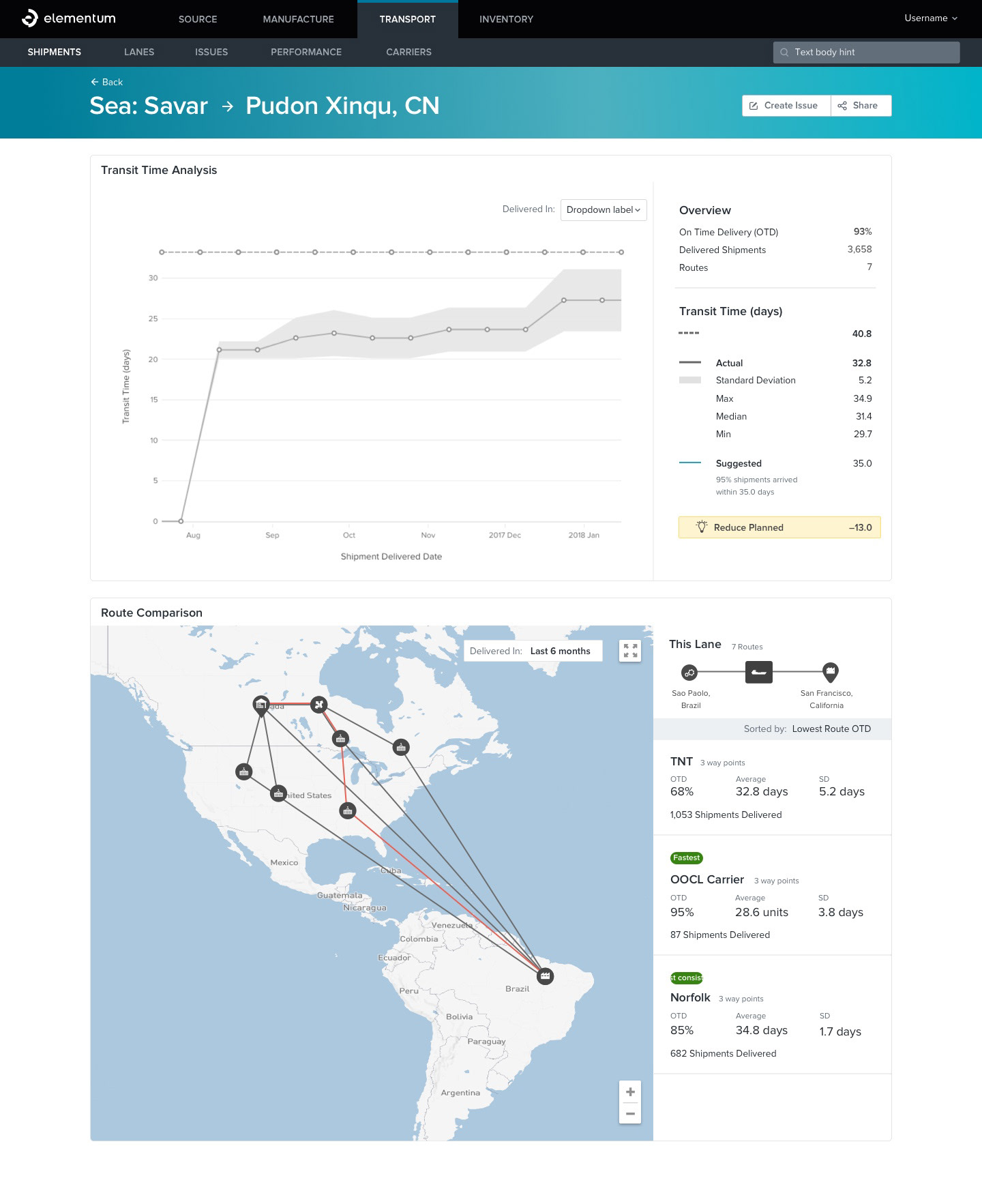
Transport details page
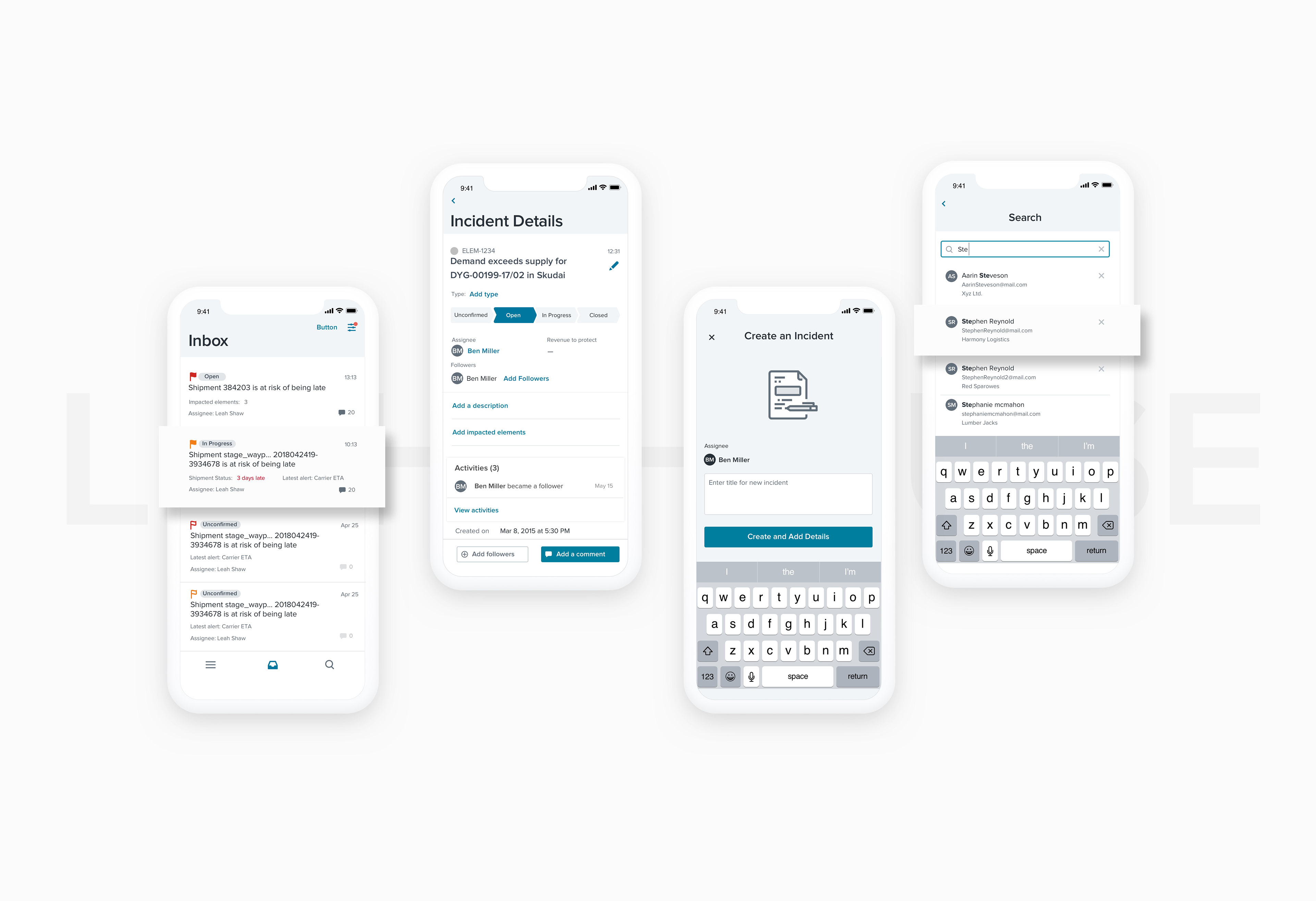
Mobile
We need to ship our product on a multitude of platforms and devices. Modules and features used on mobile are limited. But, Keeping designs synchronized takes significant effort, often requiring the same work to be repeated across all of these platforms.
With a design system in place, each piece is part of a greater whole and should contribute positively to the system at scale.
With a design system in place, each piece is part of a greater whole and should contribute positively to the system at scale.
Testing & Feedback
Testing was conducted during the discovery phase to identify the biggest pain points in the current version. During the redesign: Testing was done at every milestone of the project. Invision prototypes were shared with stakeholders to get early feedback. After numerous surveys and user pilots, we launched the platform in May 2018.